
SweetViz for Quicker In-depth Exploratory Data Analysis
Target analysis, feature analysis, correlation, all in a few lines of code — I’ve got screenshots.


Let me guess: As a data scientist, you love exploratory data analysis. You love unfolding insights from the data. You love reporting these insights, to see your not-so-technical manager in awe. I love that too.
No matter how much we love doing it, there’s only some amount of time that we can spend on exploratory data analysis (EDA). Beyond EDA, we have feature engineering, model development, deployment, and more to do in the data science lifecycle.
What if I told you there’s this tool that helps you do what you love? Fast-tracks the EDA phase but still lets you enjoy the process? Isn’t that sweet? As feedback to one of my previous articles on Pandas-Profiling, I was pointed in this direction to try a library called SweetViz (a quick thank you to everyone who shares feedback). Having used it in one of my recent projects, I loved what it had to offer.
This article will first introduce a python library called SweetViz, cover everything from installing, the features, and how you can use them in your everyday projects and analysis using a real-world example.
What’s special about SweetViz?
I was a heavy user of Pandas-Profiling, which helps me inspect and understand the data in a few minutes, with a few lines of code. So when I was told to try out SweetViz, I was reluctant. But it turned out, Pandas-Profiling inspired the authors of SweetViz, and they even re-used some of the code to build it.
SweetViz basically extends the Pandas-Profiling capabilities.
“Use the best tool that solves the problem at hand .“— Efficient data scientist
An efficient data scientist does this well: use the best tool that solves the problem at hand. Whenever an in-depth EDA is demanded in a short time frame, SweetViz is your choice. It’s vital to understand its features to use it effectively, so you know when to use it. They’ve got a bunch of features, but the main ones are,
- Inspecting and exploring the data
- Compare two datasets and feature/target analysis.
Now let’s go through each feature in our example so that you’ll feel comfortable with the library and use it in your very next project!
The Real-world Example: Diabetes Prediction
Serious complications like kidney failure, blindness, limb amputations, and heart diseases can be avoided to a great extent by treating diabetes early. Understanding the factors, symptoms, and predicting the onset of diabetes has an everlasting impact on healthcare.

The data for the following example is originally from the National Institute of Diabetes and Digestive and Kidney Diseases and is available on Kaggle. The data contains information on females at least 21 years old of Pima Indian heritage.
As we defined and understood the problem at hand, our next step is to understand and explore the data. To fast-track this process, let’s give SweetViz a try. First and foremost, we’ll have to install the library, which is pretty straightforward. Fire up your terminal and run the following command.pip install sweetviz
Make sure none of your scripts are named sweetviz.py, as that interferes with the library itself. Now that we have the environment ready let’s quickly inspect and explore the data.
Inspecting and Exploring the Data
In a matter of a few lines of code, we can generate a SweetViz report of the data and use it to inspect and explore the same.
The report generated using the code snippet above is extremely useful. This part is identical to the Pandas-Profiling, but with better design. See it for yourselves.
Let’s go over some of the useful features.
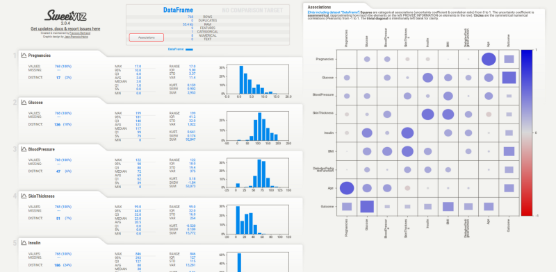
1. Overview of the data
This section at the top of the report gives you a complete overview of the data in a matter of minutes. You can scan through and pick all sorts of important information such as size, features, and data types summarized into a small table, which is extremely useful when running out of time.
2. Descriptive Statistics
Below the overview section, we have descriptive statistics for every single variable present in the data. Some statistics available for these variables are max, min, inter-quartile range, sum, coefficient of kurtosis, skewness coefficient, and more.
In python, we usually use some statistical packages like statsmodels or use pandas’ pd.describe() to generate this. But when it’s all readily available in the report, why not take advantage of it?
3. Missing Values
This is an important feature, especially because we tend to forget to do the missing value check. Missing values need to be treated before you proceed to the modeling phase. If not treated appropriately, missing values may drastically change the results we obtain post-modeling.
For every variable, SweetViz lists the percentage/count of missing values.
4. Histogram Distribution
The report generated has histograms for numerical variables and bar plots for categorical. This is extremely useful when you need to inspect for outliers and the distributions as a whole, and SweetViz does a great job.
5. Associations/Correlations
In my opinion, this is the most useful feature of them all. I keep going back to associations, sometimes even analyze them directly from the report.
Why? Machine learning is all about correlations and associations. Remember? If there’s no correlation, you can’t make any better prediction than a random guess.
Analyzing correlations help us in feature engineering and features selection phases later in the data science lifecycle.
Comparing the Train and Test Data
Once we have explored the data, we need to split the data into train and test. We also need to decide which is our target variable. The target variable can be derived from the problem definition itself.
What are we trying to predict? Whether a patient has diabetes or not.
Which variable gives us this information? In our data, it’s the outcome variable.
That’ll be our target variable.
The idea is to build a model from the train data to predict the target variable and evaluate it on the test data.
Here’s the important thing: the distributions of train and test should be similar. Sometimes a random split can change the distributions. This is generally a concern when your data is imbalanced. To analyze this better, we can use SweetViz’s compare data feature.
In the code above, we split the data 80–20% as train and test using the Sklearn’strain_test_split()function. Then we pass the two data frames to Sweetviz’s compare() function.
This will be waiting for you.
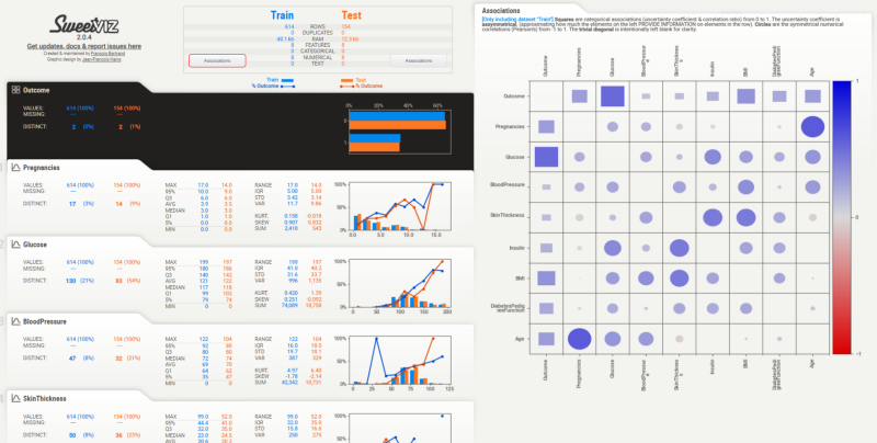
You still get all the features we discussed before. But there’s something more.
6. Feature Analysis
With this comparison of train and test data, we can easily analyze the distributions of all the features between the train and test split. For the best performance of the model, the distributions should be similar across the split.
A quick walkthrough can reveal that this is the case for our split. The correlations/associations can be seen for every feature by hovering the cursor over any feature.
7. Target Analysis
Since we specified our target variable while generating, we have a section for a target analysis right on top of the report (shaded in black). We notice that there aren’t any missing values, and the distribution remains the same between the split. The target's variation has been plotted in lines, on top of the histograms of the features.
Most of us forget to conduct this analysis in the conventional workflow. Even if we do it, it requires some more lines of code. Why bother when you’ve got this report already?
When analyzing the correlation, we notice that Glucose levels, BMI, and Age are the top three correlated features. Useful insights for the feature engineering phase.
Final Thoughts
This article introduced a new library called SweetViz, which helps us fast-track the exploratory data analysis phase. We went through a real-world example of diabetes prediction, used the library for a thorough data understanding, and went on to do an in-depth analysis after splitting the data into train and test.
Though we discover many insights using this tool in the article, there’s more to it. If not, what’s the point of having you, the data scientist?
You’re a smart person. You’re an efficient data scientist. You try to use the best tools that can supplement your work. You always know there’s more to it. You put in your additional effort to uncover more insights and strive to become a world-class data scientist.
You might not be there yet, nor am I. We all are on the learning journey while helping each other. That’s all that matters.
I hope you enjoyed reading as much as I enjoyed writing this for you. I write extensively about my learning experiences in data science here in Medium. Feel free to connect with me on LinkedIn, and I’d love to hear all kinds of feedback.