
Building Your First Desktop Application using PySide6 [A Data Scientist Edition]
Surprise, surprise. It’s not as hard as I thought it would be.

![Building Your First Desktop Application using PySide6 [A Data Scientist Edition]](https://images.unsplash.com/photo-1614624532983-4ce03382d63d?crop=entropy&cs=tinysrgb&fit=max&fm=jpg&ixid=M3wxMTc3M3wwfDF8c2VhcmNofDV8fGRlc2t0b3B8ZW58MHx8fHwxNzEzMjI3MjI0fDA&ixlib=rb-4.0.3&q=80&w=2000)
The hardest part of my data scientist job is convincing the non-technical stakeholders to realize how yet another data science solution can help them make better decisions.
This is not new to me, though. It’s been like this in my 5+ years of experience as a data scientist and machine learning engineer.
After multiple trials and errors, what has worked for me in the order are:
- Share regular progress updates (presentation slides) by simplifying the technical concepts.
- Building a machine learning web application towards the end of the project to give stakeholders, the experience of interacting with the solution we’ve collaboratively built.
However, a twist was that my colleague on the same team for about 5 years, had built a desktop application (instead of a web application) for a different use case using .NET. The team’s loving it.
So I asked myself: why not build a desktop rather than a web application?
There was one problem though, not just that I don’t know .NET to begin with, but never have I built a desktop application before. Oops.
PySide6 to the rescue
Since I know Python is a general-purpose programming language, I wanted to see if I could build desktop applications directly from Python.
A few Google searches later, two frameworks stood out:
Both, Pyside6 and Tkinter, use Python as wrappers to build desktop applications — exactly what I was looking for. I browsed through tutorials on each and decided to try PySide6. I might probably try Tkinter someday later, but that’s not the point:
Less over-thinking, and quicker execution.
So I jumped right in.
To my surprise, it wasn’t as hard as I thought.
If you know Python, you know PySide6. If you know PySide6, building simple desktop applications can be a breeze.
Maybe you can stick around till the end of the article, and you’ll see it for yourself?
First, what is PySide6?
PySide6 is a Python library that allows us to create GUI/desktop applications. Behind the hood, PySide6 is a wrapper to Qt6, the latest version of a UI framework called Qt.
Simply put: using PySide6, we can create fully functional applications that work on Windows, Mac, Linux, and even mobile platforms.
Setting up your PySide6 virtual environment
As always when we’re starting to use a new library, it’s best to create a new virtual environment and install all required libraries inside it.
First, let us create and activate the virtual environment. Please ensure you have Python installed on your local machine already. Open your terminal and type the following:
python -m venv env

source env/bin/activate
Once the virtual environment is activated, install PySide6 through pip using the following command:
pip install pyside6Once installed you can import pyside6, and check the version, to ensure everything is properly installed. The entire process is summarized below:
The “Hello World” of PySide6
Remember the good old days when you started learning programming?
A decade ago, my lecturer wrote a few lines of code on the whiteboard and asked us to copy that onto our text editor. We diligently copied word to word. Then we clicked a few buttons as we were instructed. Then, the terminal printed out “Hello World” out of nowhere.
You should see our excitement! We beamed with wide eyes to show our lecturer that it worked.
While that excitement is hard to replicate now, after a decade-long of coding, it’s fun to create a quick “Hello World” version of a desktop application using PySide6, as our quick win.
So here we go.
Like a good student, create a file called “hello-world.py” and copy and paste the following into your code editor.
import sys
from PySide6.QtWidgets import QApplication, QLabel

# Create the application instance
app = QApplication(sys.argv)

# Create a label widget with the text "Hello World"
label = QLabel("Hello World")

# Show the label
label.show()

# Run the application's event loop
sys.exit(app.exec())
Now run the following command on the terminal.
python run hello-world.pyYou should be seeing something like this:
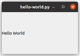
I’ll wait for a moment for you to process your excitement... Good? Great.
Now here’s what our code did.
- Line 1:
import sys: This imports thesysmodule, which provides access to some variables used or maintained by the Python interpreter and to functions that interact strongly with the interpreter. - Line 2:
from PySide6.QtWidgets import QApplication, QLabel: This imports theQApplicationandQLabelclasses from thePySide6.QtWidgetsmodule.QApplicationis used to manage application-wide resources and settings, whileQLabelis used to display text or images. - Line 3:
app = QApplication(sys.argv): This creates an instance ofQApplication.sys.argvis a list of command-line arguments passed to the Python script. In a GUI application, it's common to passsys.argvtoQApplicationso that it can handle any command-line arguments that are specific to Qt or the underlying platform. - Line 4:
label = QLabel("Hello World"): This creates an instance ofQLabelwith the text "Hello World". - Line 5:
label.show(): This displays the label. By default, widgets in Qt are not shown until you explicitly call theirshow()method. - Line 6:
sys.exit(app.exec()): This starts the application's event loop by callingapp.exec(). The event loop is what allows the application to remain responsive to user interactions.sys.exit()ensures that the application exits cleanly when the event loop is terminated.
That’s it. 6 lines of code is all it takes for the “Hello World” of a desktop application.
Next, most tutorials available online would teach you about buttons, widgets, and other 971 features included in the library. While they are important, I feel for a data scientist edition, picking a dataset and building a simple desktop application around it with some quick insights is the best way to learn PySide6 quickly.
Let’s focus on these 3 steps:
- Select an interesting dataset we’d like to analyze
- Create standalone visualizations as answers to interesting questions on the dataset
- Wrap these visualizations in a desktop application
Our goal is to build our first app, which can be repeated for various use cases.
Your First Desktop App: Valentine's Day Consumer Analysis
Valentine's Day was around the corner when I started working on this, so I figured it would be cool to analyze how people spend during this time, and then convert it into a Desktop app. All codes, and data used in this article are available in a GitHub repository, so it’s easier for you to follow along.
Again — lesser overthinking and quicker execution.

Step 1: Selecting a dataset
The National Retail Federation in the United States has been conducting surveys on how people plan to celebrate Valentine’s Day for over a decade. We’ll use their survey data for our analysis, which you can download from Kaggle, and is free to use under the Creative Commons Public Domain license.
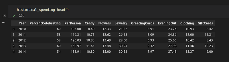
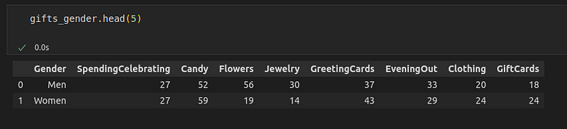
Let’s import the required libraries and read the datasets into data frames.
# Import required libraries
import pandas as pd
import matplotlib.pyplot as plt # used for visualizations later
# Load the datasets
historical_spending = pd.read_csv('data/historical_spending.csv')
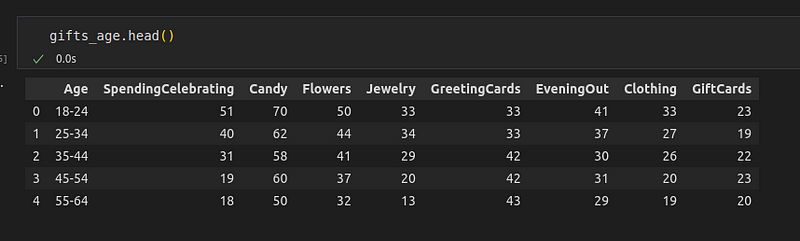
gifts_gender = pd.read_csv('data/gifts_gender.csv')
gifts_age = pd.read_csv('data/gifts_age.csv')As we see, the dataset has 3 CSV files:
- Historical Spending: This dataset tracks the percentage of people celebrating Valentine’s Day, average spending per person, and the amount spent on specific gift categories (Candy, Flowers, Jewelry, Greeting Cards, Evening Out, Clothing, and Gift Cards) over a period from 2010 to 2019.
- Gifts by gender: This dataset compares the spending habits of men and women on Valentine’s Day, including the percentage of people celebrating and the percentage of spending on different gift categories.
- Gifts by age: This dataset breaks down Valentine’s Day spending habits by age groups, showing the percentage of spending on celebrating and various gift categories.
Some interesting questions we can ask on this dataset are:
- Historical Spending Trends: How has the average spending per person on Valentine’s Day changed over the last decade, and which gift categories have seen the most significant increase or decrease in spending?
- Gender Differences in Gift Preferences: How do the spending patterns on different gift categories for Valentine’s Day differ between men and women?
- Age Group Preferences: What are the preferred gift categories for Valentine’s Day among different age groups, and how does this preference change with age?
Now that we have a dataset and some questions for them, let’s answer them using standalone visualizations using a popular Python library such as Matplotlib.
Step 2: Creating standalone visualizations
To know about the spending patterns during Valentine’s Day over the past decade, we can plot a line graph on each variable.
The code will look something like:
# Create a color palette
palette = plt.get_cmap('Set1')
# Plot each column
num = 0
for column in historical_spending.drop(['Year', 'PercentCelebrating'], axis=1):
num += 1
plt.plot(historical_spending['Year'], historical_spending[column], marker='', color=palette(num), linewidth=2.5, alpha=0.9, label=column)
# Add legend
plt.legend(loc=2, ncol=2)
# Add titles
plt.title("Historical Spending Trends on Valentine's Day (2010-2019)", loc='left', fontsize=12, fontweight=0, color='orange')
plt.xlabel("Year")
plt.ylabel("Spending ($)")
plt.xticks(historical_spending['Year'])
# Show the plot
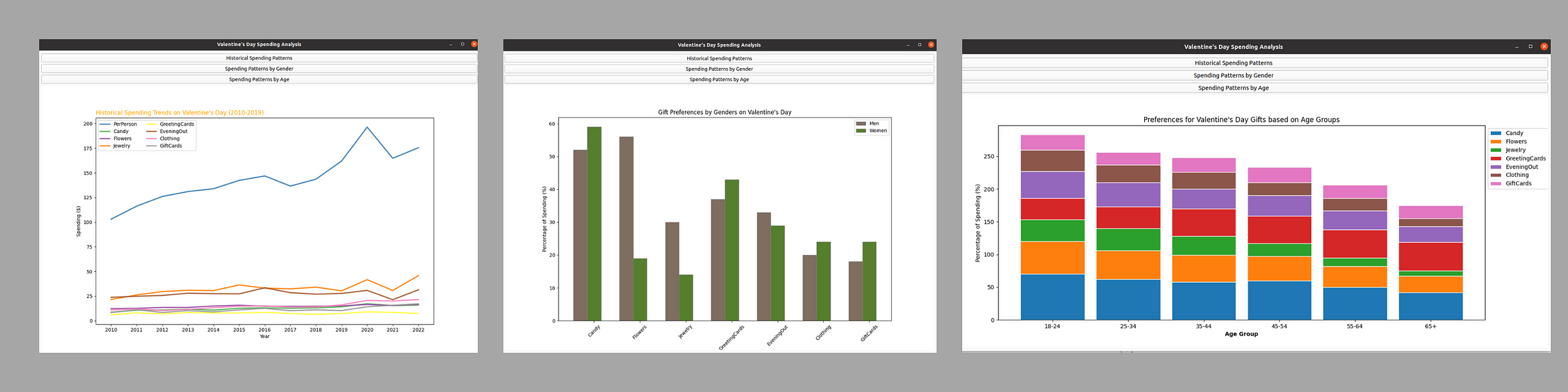
plt.show()The output is:
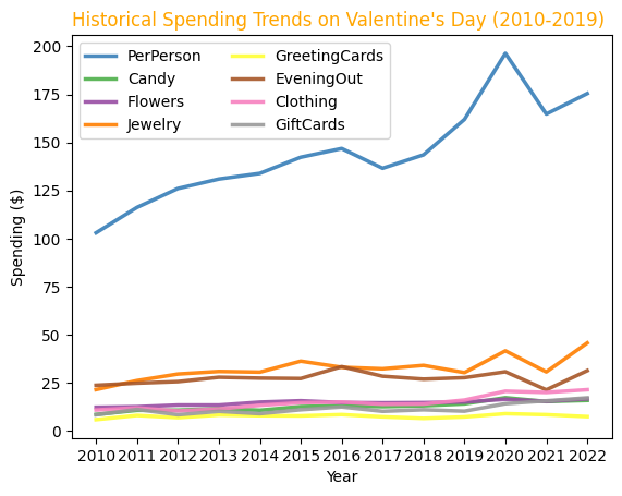
We can see a significant rise in spending from 2017 to 2020, and drop again during 2021. Post 2021, the spending again is seen to rise. Amidst the categories, jewellery and evening out have been the most spent on categories.
Let’s move on to the next question: How do the spending patterns on different gift categories for Valentine’s Day differ between men and women?
To understand this, we can create a bar plot that compares the spending patterns of both genders.
# Set the width of the bars
barWidth = 0.3

# Remove the 'SpendingCelebrating' column which is not a gift category
gifts_gender = gifts_gender.drop('SpendingCelebrating', axis=1)

# Set position of bar on X axis
r1 = range(len(gifts_gender.columns[1:]))
r2 = [x + barWidth for x in r1]

# Make the plot
plt.bar(r1, gifts_gender.iloc[0, 1:], color='#7f6d5f', width=barWidth, edgecolor='grey', label='Men')
plt.bar(r2, gifts_gender.iloc[1, 1:], color='#557f2d', width=barWidth, edgecolor='grey', label='Women')

# Add xticks on the middle of the group bars
plt.xlabel('Gift Categories', fontweight='bold')
plt.xticks([r + barWidth for r in range(len(gifts_gender.columns[1:]))], gifts_gender.columns[1:], rotation=45)
plt.ylabel('Percentage of Spending (%)')
plt.title('Gender Differences in Gift Preferences on Valentine\'s Day')

# Create legend & Show graphic
plt.legend()
plt.show()
The output is:
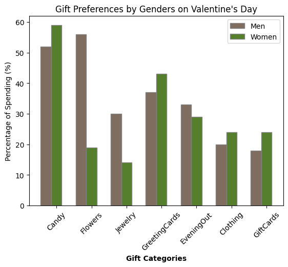
While women spend on candy, greeting cards, clothes and gift cards, men seem to be getting jewellery, and flowers or spending the most on evenings out.
Let’s move on to our last question: What are the preferred gift categories for Valentine’s Day among different age groups, and how does this preference change with age?
The code is as follows:
# Remove the 'SpendingCelebrating' column which is not a gift category
gifts_age = gifts_age.drop('SpendingCelebrating', axis=1)

# Set the width of the bars
barWidth = 0.85

# Set the position of the bars on the x-axis
r = range(len(gifts_age))

# Plot
for i, col in enumerate(gifts_age.columns[1:]):
    plt.bar(r, gifts_age[col], bottom=gifts_age[gifts_age.columns[1:i+1]].sum(axis=1),
            edgecolor='white', width=barWidth, label=col)

# Add xticks on the middle of the group bars
plt.xlabel('Age Group', fontweight='bold')
plt.xticks(r, gifts_age['Age'])
plt.ylabel('Percentage of Spending (%)')
plt.title('Preferences for Valentine\'s Day Gifts based on Age Groups')

# Create legend & Show graphic
plt.legend(loc='upper left', bbox_to_anchor=(1,1), ncol=1)
plt.show()
The output visualization is:
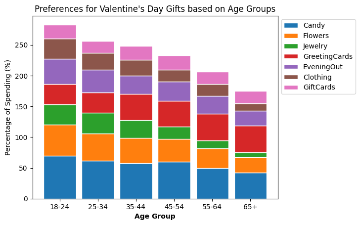
Candy dominates spending across all age groups, and greeting cards have increased spending in the oldest 65+ age group. We also see the overall spending on gifts reduce as the age group increases.
These insights can be presented as reports or dashboards, but we will build an interactive application to showcase these results next.
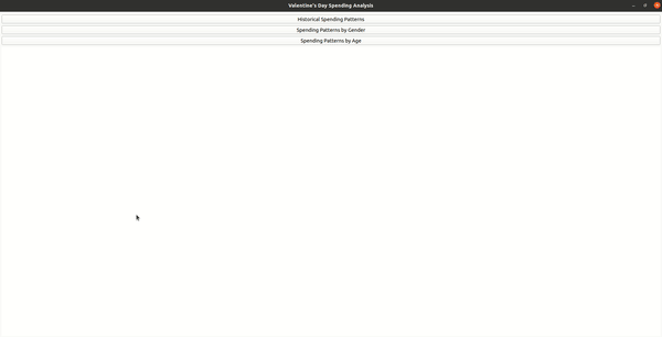
Step 3: Wrapping the visualization as a Desktop App
So far we already know how to create a basic hello-world application. We also just saw how to create the required visualizations. We did these first such that the natural progression is to combine these two into an application.
We want an application to take user input as a button and show the relevant visualization. Let’s see the code first, and understand how we arrived at it, later.
import sys
from PySide6.QtWidgets import QApplication, QMainWindow, QPushButton, QVBoxLayout, QWidget
from matplotlib.backends.backend_qt5agg import FigureCanvasQTAgg as FigureCanvas
from matplotlib.figure import Figure
import matplotlib.pyplot as plt
import pandas as pd

class MplCanvas(FigureCanvas):
    def __init__(self):
        self.fig = Figure()
        super().__init__(self.fig)
        self.historical_spending = pd.read_csv('data/historical_spending.csv')
        self.gifts_gender = pd.read_csv('data/gifts_gender.csv')
        self.gifts_age = pd.read_csv('data/gifts_age.csv')

    def plot_historical_spending(self):
        self.fig.clf()
        ax = self.fig.add_subplot(111)
        palette = plt.get_cmap('Set1')

        # Plot each column
        num = 0
        for column in self.historical_spending.drop(['Year', 'PercentCelebrating'], axis=1):
            num += 1
            ax.plot(self.historical_spending['Year'], self.historical_spending[column], marker='', color=palette(num), linewidth=2.5, alpha=0.9, label=column)

        # Add legend and titles using the axis object
        ax.legend(loc=2, ncol=2)
        ax.set_title("Historical Spending Trends on Valentine's Day (2010-2019)", loc='left', fontsize=12, fontweight=0, color='orange')
        ax.set_xlabel("Year")
        ax.set_ylabel("Spending ($)")
        ax.set_xticks(self.historical_spending['Year'])

        # Refresh canvas
        self.draw()

    def plot_gender_spending(self):
        self.fig.clf()
        ax = self.fig.add_subplot(111)
        barWidth = 0.3

        if 'SpendingCelebrating' in self.gifts_gender.columns:
            self.gifts_gender = self.gifts_gender.drop('SpendingCelebrating', axis=1)

        r1 = range(len(self.gifts_gender.columns[1:]))
        r2 = [x + barWidth for x in r1]

        ax.bar(r1, self.gifts_gender.iloc[0, 1:], color='#7f6d5f', width=barWidth, edgecolor='grey', label='Men')
        ax.bar(r2, self.gifts_gender.iloc[1, 1:], color='#557f2d', width=barWidth, edgecolor='grey', label='Women')

        ax.set_xlabel('Gift Categories', fontweight='bold')
        ax.set_xticks([r + barWidth for r in range(len(self.gifts_gender.columns[1:]))], self.gifts_gender.columns[1:], rotation=45)
        ax.set_ylabel('Percentage of Spending (%)')
        ax.set_title('Gift Preferences by Genders on Valentine\'s Day')
        ax.legend()

        # Refresh canvas
        self.draw()

    def plot_age_spending(self):
        self.fig.clf()
        ax = self.fig.add_subplot(111)
        barWidth = 0.85

        if 'SpendingCelebrating' in self.gifts_age.columns:
            self.gifts_age = self.gifts_age.drop('SpendingCelebrating', axis=1)

        r = range(len(self.gifts_age))

        for i, col in enumerate(self.gifts_age.columns[1:]):
            ax.bar(r, self.gifts_age[col], bottom=self.gifts_age[self.gifts_age.columns[1:i+1]].sum(axis=1),
                   edgecolor='white', width=barWidth, label=col)

        ax.set_xlabel('Age Group', fontweight='bold')
        ax.set_xticks(r, self.gifts_age['Age'])
        ax.set_ylabel('Percentage of Spending (%)')
        ax.set_title('Preferences for Valentine\'s Day Gifts based on Age Groups')
        ax.legend(loc='upper left', bbox_to_anchor=(1,1), ncol=1)

        # Refresh canvas
        self.draw()

class MainWindow(QMainWindow):
    def __init__(self):
        super().__init__()

        # Canvas setup
        self.canvas = MplCanvas()

        # Buttons
        self.btn_historical = QPushButton('Historical Spending Patterns')
        self.btn_historical.clicked.connect(self.canvas.plot_historical_spending)

        self.btn_gender = QPushButton('Spending Patterns by Gender')
        self.btn_gender.clicked.connect(self.canvas.plot_gender_spending)

        self.btn_age = QPushButton('Spending Patterns by Age')
        self.btn_age.clicked.connect(self.canvas.plot_age_spending)

        # Layout setup
        layout = QVBoxLayout()
        layout.addWidget(self.btn_historical)
        layout.addWidget(self.btn_gender)
        layout.addWidget(self.btn_age)
        layout.addWidget(self.canvas)

        # Central Widget
        widget = QWidget()
        widget.setLayout(layout)
        self.setCentralWidget(widget)

        # Window title
        self.setWindowTitle('Valentine\'s Day Spending Analysis')

# Start Qt event loop
if __name__ == '__main__':
    app = QApplication(sys.argv)
    mainWin = MainWindow()
    mainWin.show()
    sys.exit(app.exec())
I know it’s a lot to digest, especially for the first desktop application.
If you examine carefully, most of the code has been reused from the visualizations we’ve already created in the earlier step.
Nevertheless, we’ll break it down into chunks, and absorb it piece by piece.
At first glance, we see two different Classes present in the code.
1/ MplCanvas Class:
This class is a custom widget that serves as a container for Matplotlib figures. Here’s where the visualization is embedded. It inherits from FigureCanvasQTAgg, which is a specific backend of Matplotlib that integrates with Qt's event loop, making it possible to embed Matplotlib figures in Qt applications.
Here's what the MplCanvas class does:
Initialization (__init__ method):
- Initializes a new Matplotlib
Figureobject which will serve as the canvas for plotting. - Calls the initializer of its base class (
FigureCanvas) with this figure, which sets up the canvas widget. - Loads the three datasets from CSV files into pandas DataFrames, which are then used for data visualization. Notice the syntax change from the traditional codes, where the data frame is assigned to an attribute to the class object.
self.historical_spending = pd.read_csv('data/historical_spending.csv')
self.gifts_gender = pd.read_csv('data/gifts_gender.csv')
self.gifts_age = pd.read_csv('data/gifts_age.csv')
Data Visualization Methods:
We also refactor the visualization codes into simple functions under the class. The core lines of code we used to create the visualizations remain unchanged.
plot_historical_spending: Clears the current figure, sets up a new subplot, and creates a line chart displaying historical spending trends based on thehistorical_spendingDataFrame. It sets the title, labels, and legend of the plot.plot_gender_spending: Clears the figure and creates a bar chart comparing the spending patterns by gender using thegifts_genderDataFrame. It modifies the DataFrame to remove an unwanted column, sets the plot's axes, and adds a legend.plot_age_spending: Similar to the other plotting methods, it clears the figure and creates a bar chart to display the spending patterns by different age groups from thegifts_ageDataFrame.
Notice that we replaced all instances of plt with ax, which is the Axes instance created by self.fig.add_subplot(111). This directs the plotting commands to the Axes object associated with the FigureCanvas, rather than the global Matplotlib state. Each of these methods ends with a call to self.draw(), which updates the canvas with the new figure. This is crucial for displaying the new plot after the figure is cleared and redrawn.
2/ MainWindow Class:
MainWindow is the main application window for the PySide6 application. It inherits from QMainWindow, which is a convenient Qt class for creating a window with a menu bar, status bar, and central widget. This class is responsible for the application's UI layout and interactivity.
Here's the role of the MainWindow class:
- Initializing the
MplCanvasobject, the custom Matplotlib canvas widget where plots will be displayed. - Creating three buttons allows the user to select which data visualization to display.
- Connecting the buttons’ clicked signals to the appropriate plotting methods of the
MplCanvasinstance. This ensures that when a button is clicked, the corresponding plot is drawn on the canvas. - Organizes the buttons and the canvas widget into a vertical box layout (
QVBoxLayout), which defines the overall layout of the main window. - Setting the central widget of the
QMainWindowto aQWidgetthat holds the box layout. This is required because a layout cannot be set directly on theQMainWindow.
All codes we’ve used in this article have been stored in a GitHub repository for your reference.
Let us see our final application:
Final Thoughts — An upgrade to the App?
Why not.
I’m hooked — I don’t want to stop here. How about if we build a machine learning application where we provide inputs and obtain a prediction? And maybe add some visualizations to it similar to what we saw today?
So if it interests you, you probably would want to follow me here on Medium or LinkedIn to avoid missing it. I’m open to hearing your ideas on what to build next (in the comments!)
Meanwhile here are the additional (free) resources I found useful to build this app:
- Official documentation for PySide6
- Complete tutorials for PySide6 from an developer point-of-view (Blog)
- Learn Python GUI Development for Desktop from freeCodeCamp (YouTube)
Would you believe it if all of this happened over a weekend? We can get a lot done in a short time if we actually want to.
I’ve made it simple with this guide, all you have to do to get started is to follow along. Open up your favourite editor, install the required libraries, download the dataset, and build what you love. If you did — share it with me in the comments below.
I can’t wait to see what you build!
For more helpful insights on breaking into data science, honest experiences, and learnings, consider joining my private list of email friends.